
PANACEA SKINCARE + JINX // BRANDING IDENTITY
Branding process for Panacea Skincare, a skincare brand rooted in the morning routine.
Good skin and good days start on purpose.
The belief being that simple, intentional skincare routine repeated daily will create more beautiful skin and prime you for more successes throughout the rest of the day.

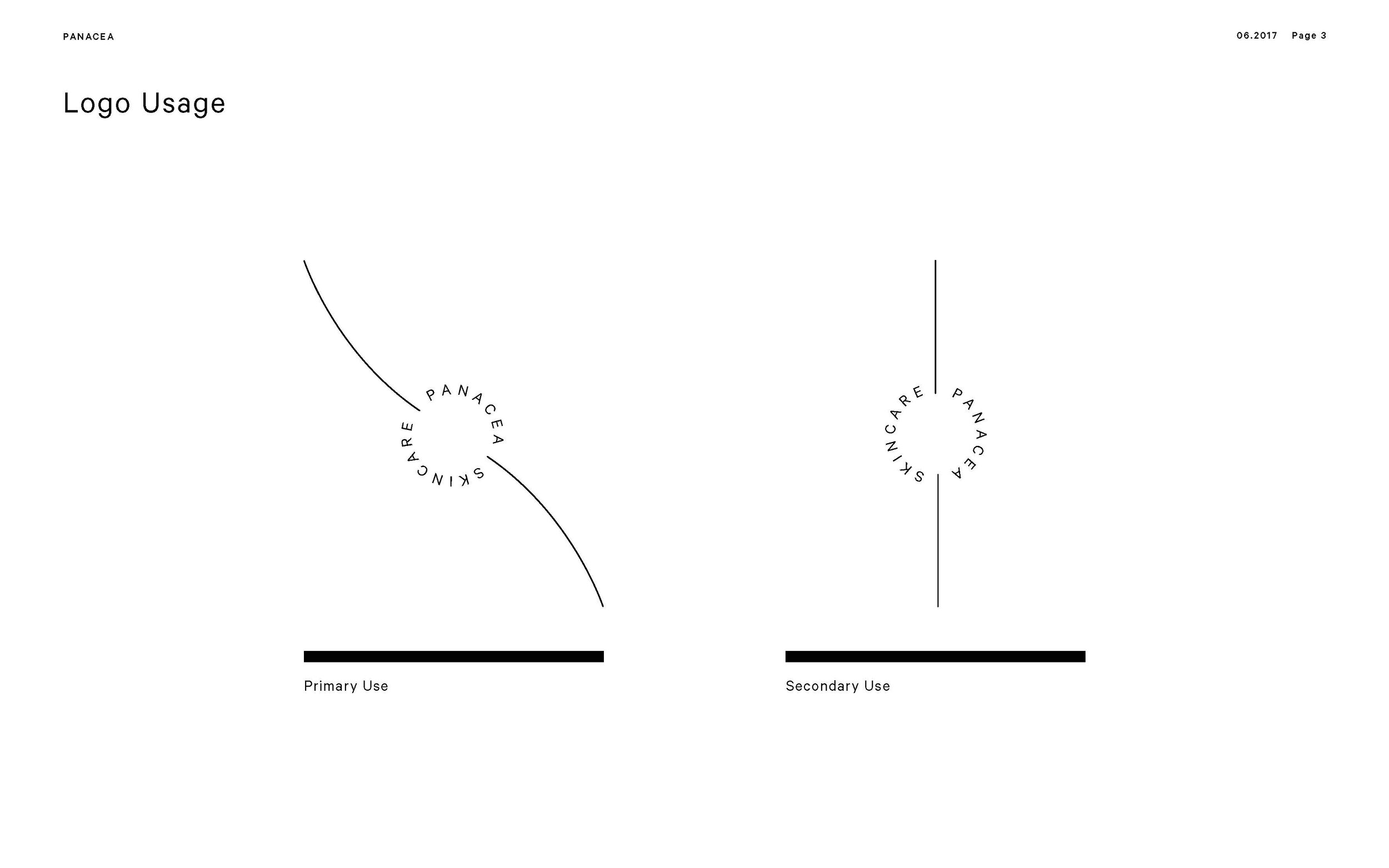
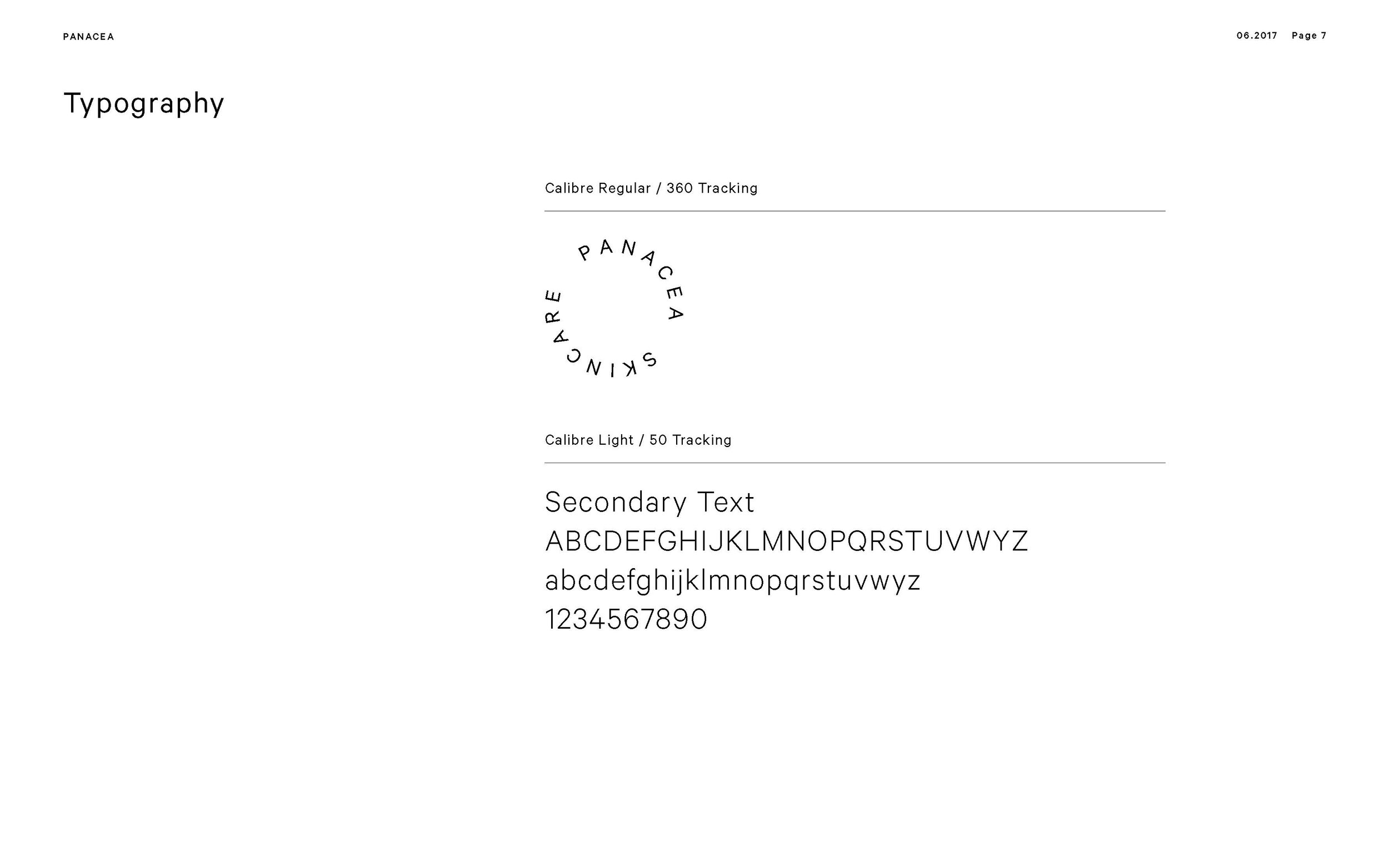
PANACEA SKINCARE - the LOGO
Panacea Skincare is focused around intentional choices in the morning routine to provide bigger success throughout the day. Whether it is making your bed or going to the gym, each of these little things add up.
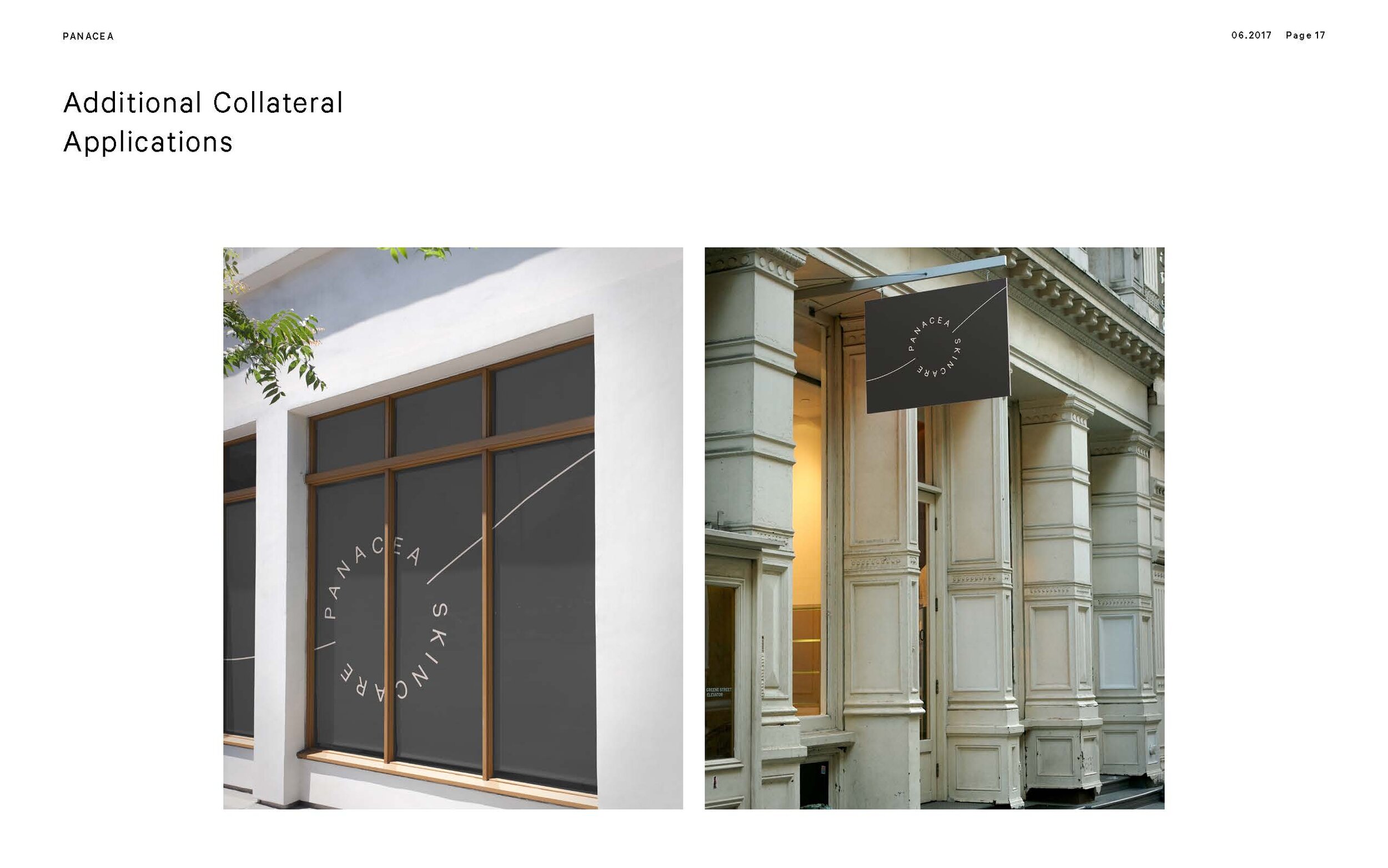
The logo was inspired by having the skincare routine serve as the focal point of an intentional morning. It features a circular wordmark accompanied by a line that represents the theme of intention. The line theme proliferates to the packaging design, website elements, and social imagery.
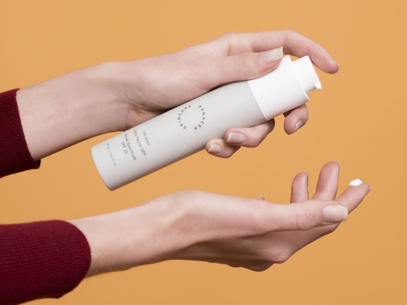
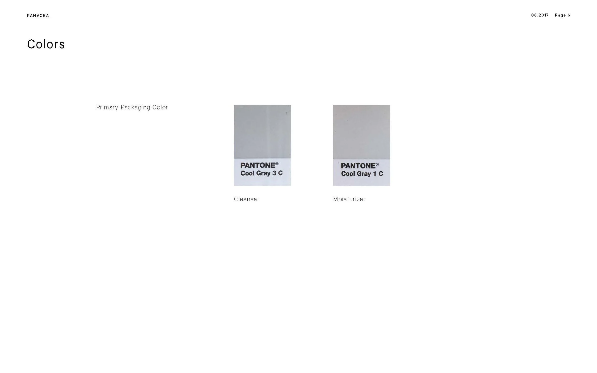
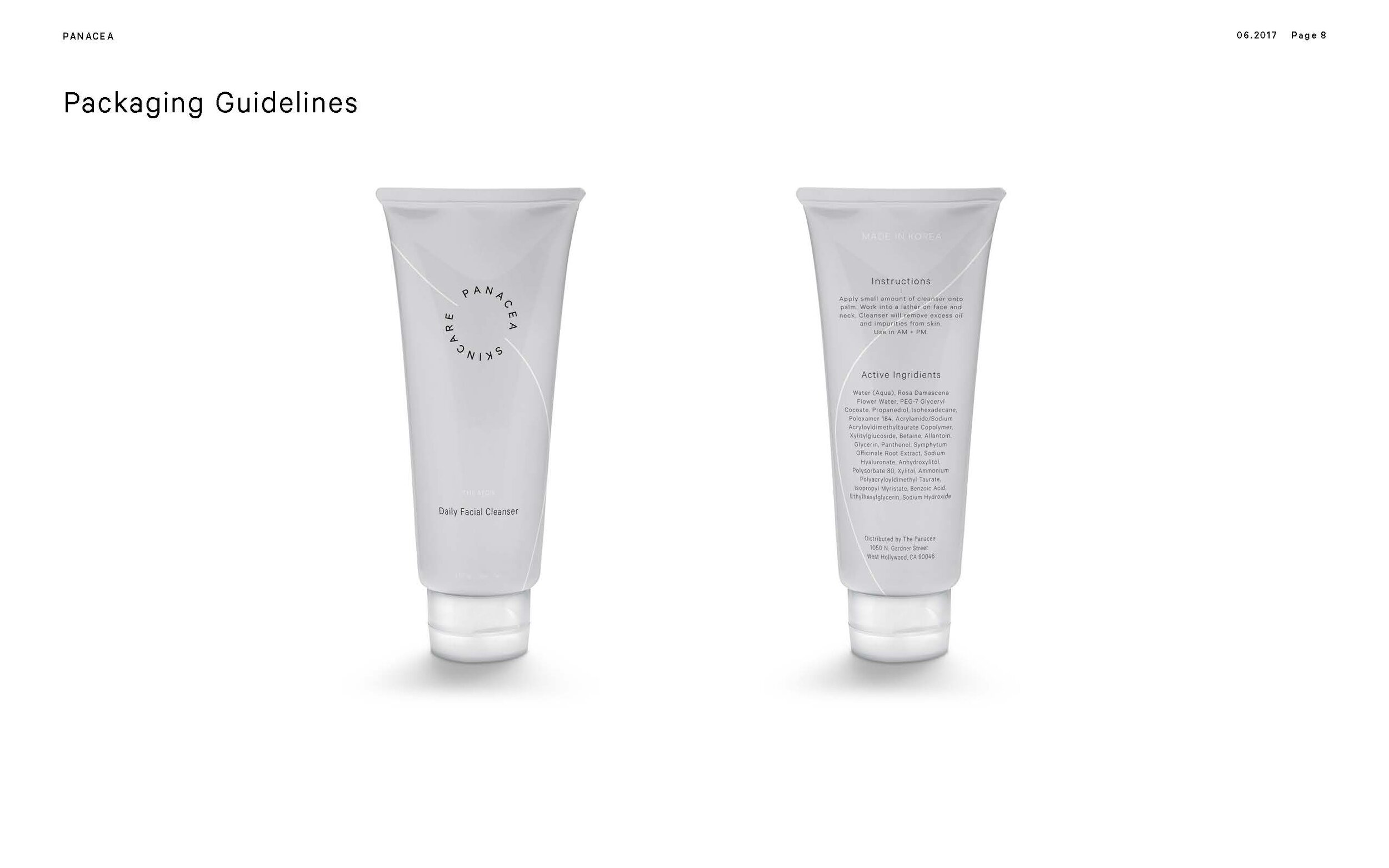
PANACEA SKINCARE - product packaging
Panacea Skincare is a comprehensive gender-netural line that simplifies the traditional 10+ step K-beauty regimen by bringing the best worlds of Korean beauty technology and modern global ingredients and paring it down to three essentials: cleanser, moisturizer, and SPF.
Being gender-neutral, the product packaging fall feature a monochromatic color palette that is meant to be accompanied by packaging elements or photography that brings color and life.
In having a three-product set, each packaging option was designed to feel like a set but have their own unique characteristics to promote the product as a set.

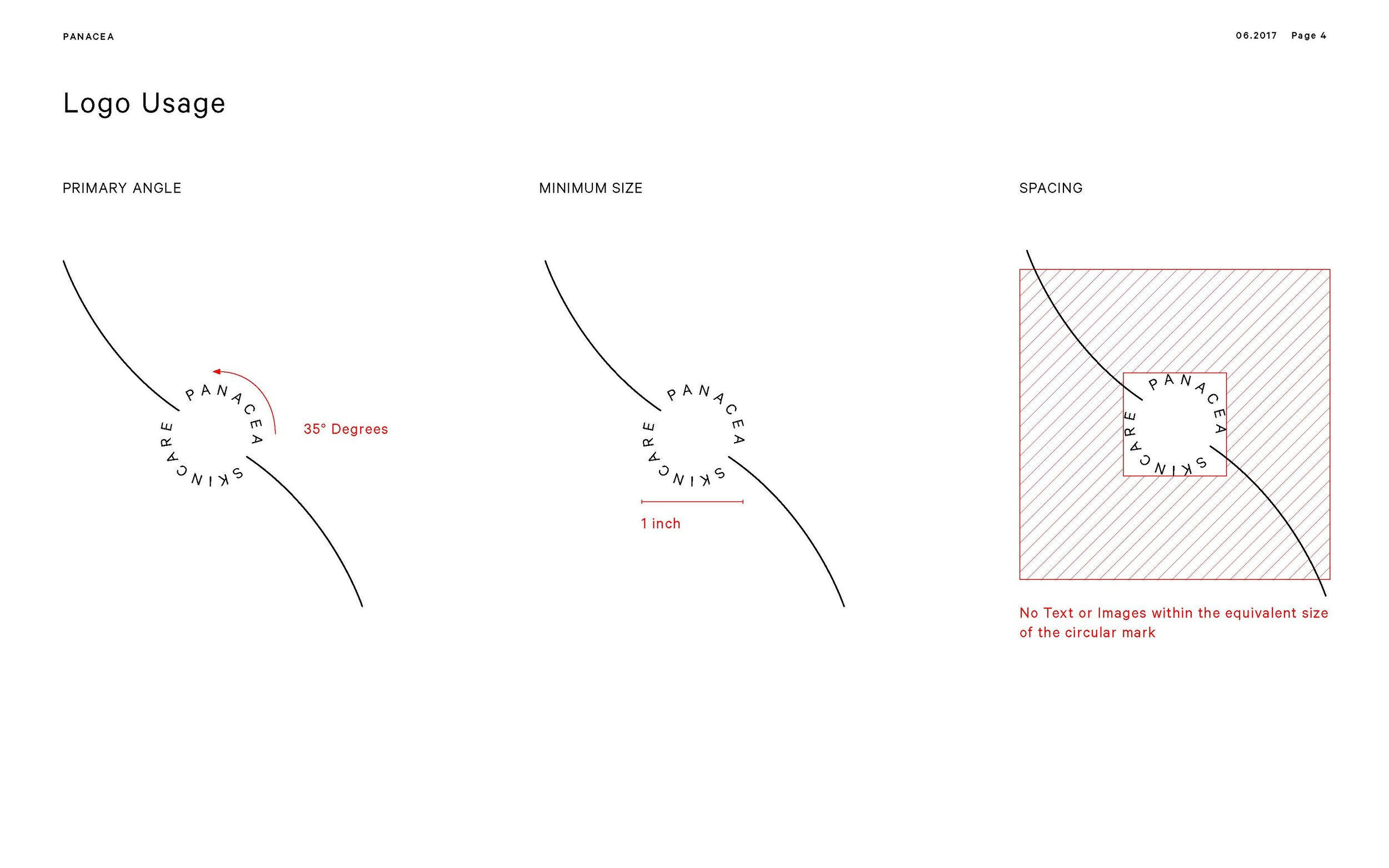
PANACEA SKINCARE - Brand guidelines
To keep the brand identity consistent across mediums, I created a brand guidelines deck to be sent used internally and externally. The goal was to give creatives in or out of house an idea of what the look and feel and to insure alignment.
The brand guidelines deck dictates the usage of the logo, the typefaces of the brand, and the look and feel for imagery.

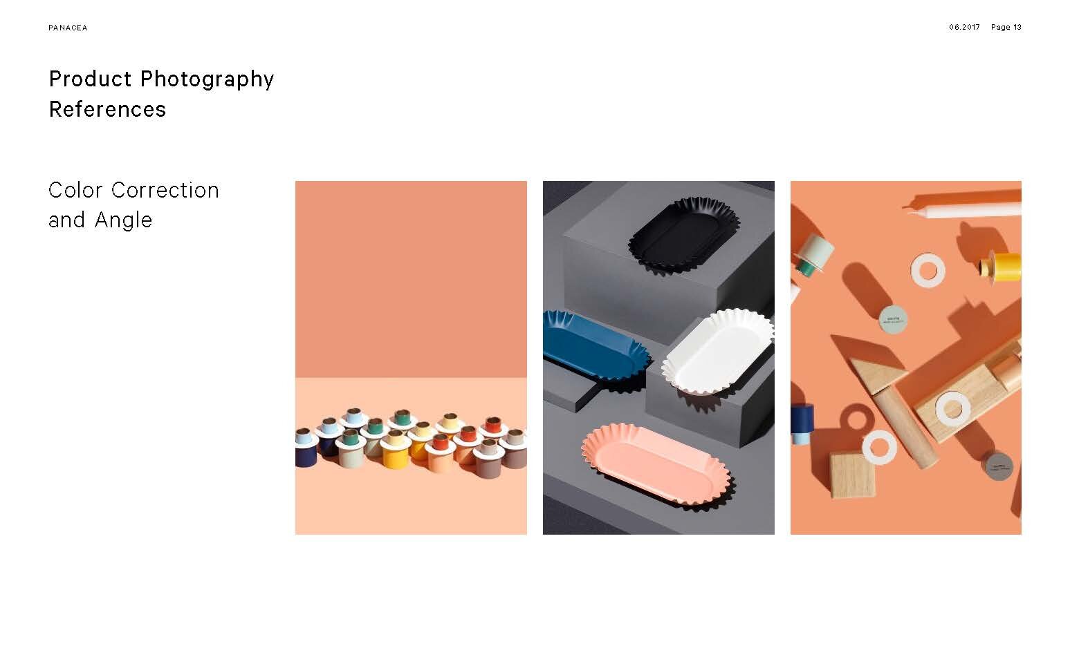
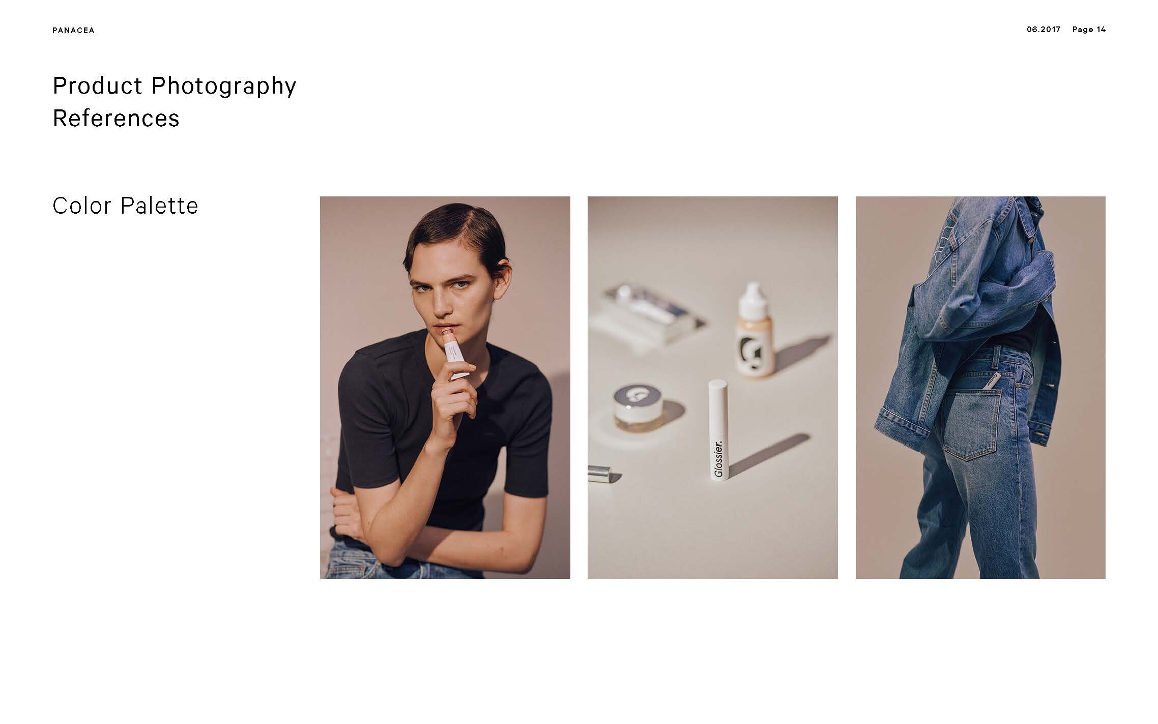
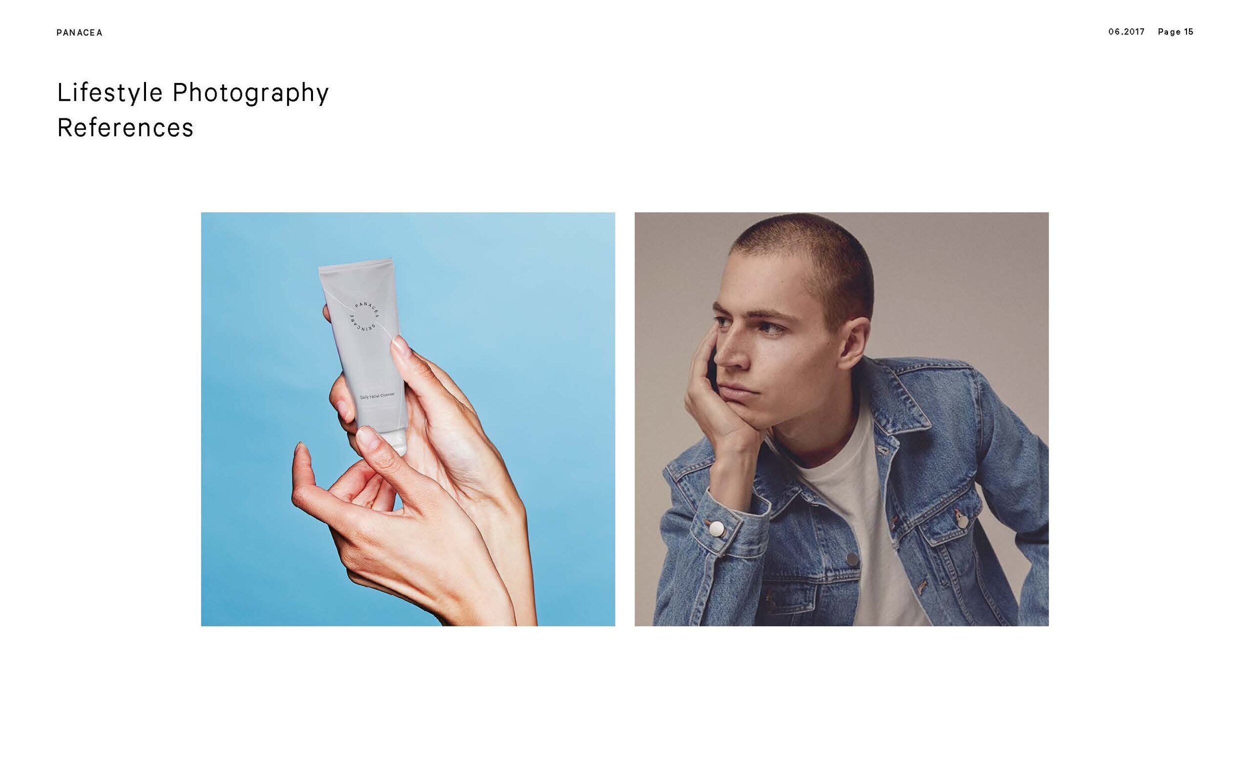
PANACEA SKINCARE - aesthetic / mood
In order to fall in line with a gender-neutral theme and keep a consistent, modern look, Panacea skincare features a minimalistic, clean look that aims to make a skincare brand feel inspirational.
The minimalist look ties into the packaging and relies heavily on the supplemental elements and photography to bring life to the product.
JINX FOOD FOR DOGS REBRAND + WEBSITE REFRESH
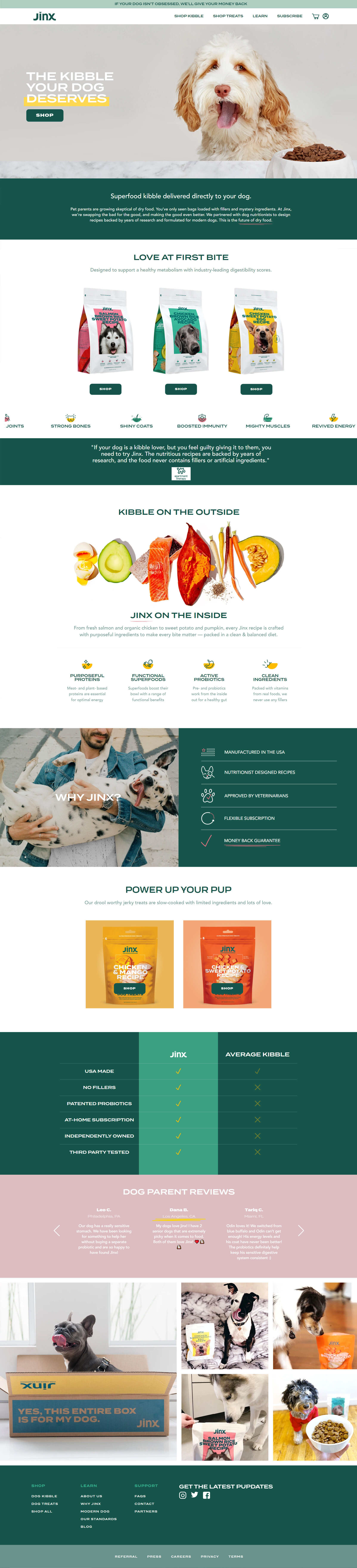
The goal of this brand overhaul was to focus Jinx, a nascent dog food company, on a more targeted market. From launch, they had a pretty minimal look and feel. They wanted to use a lot of the things brand design elements that they had started out with but bring a bit more emotion and playfulness to the brand. Another objective was to push the subscription side of their business.
OLD JINX HOMEPAGE

NEW JINX HOME PAGE